Colored papers and letterpress ink
Personally, I love using colored papers in my letterpress designs, but I didn't always. The paper I use for just about all the invitations in our semi-custom collection is made from 100% cotton, and is made from a byproduct of the cotton industry, earning it the label of a reclaimed fiber. But beyond its eco-friendliness, it is available in a range of thicknesses (usually referred to as "weight") and is less dense—soft and pillowy are words often used to describe it. These qualities lend itself to that deep letterpress impression that we're all after. But this lovely cotton paper is mostly available in shades of white and gray. So what if you want some color?
There are a few manufacturers making a whole gorgeous range of colored papers, and most are pretty eco-friendly, though usually still made from trees. They tend to be a little thinner than cotton letterpress papers (even if they have almost the same weight, they tend to be a little denser and so feel slightly thinner). But they are still high-quality cardstocks that take a letterpress impression well, and using them can add so much dimension to your projects!
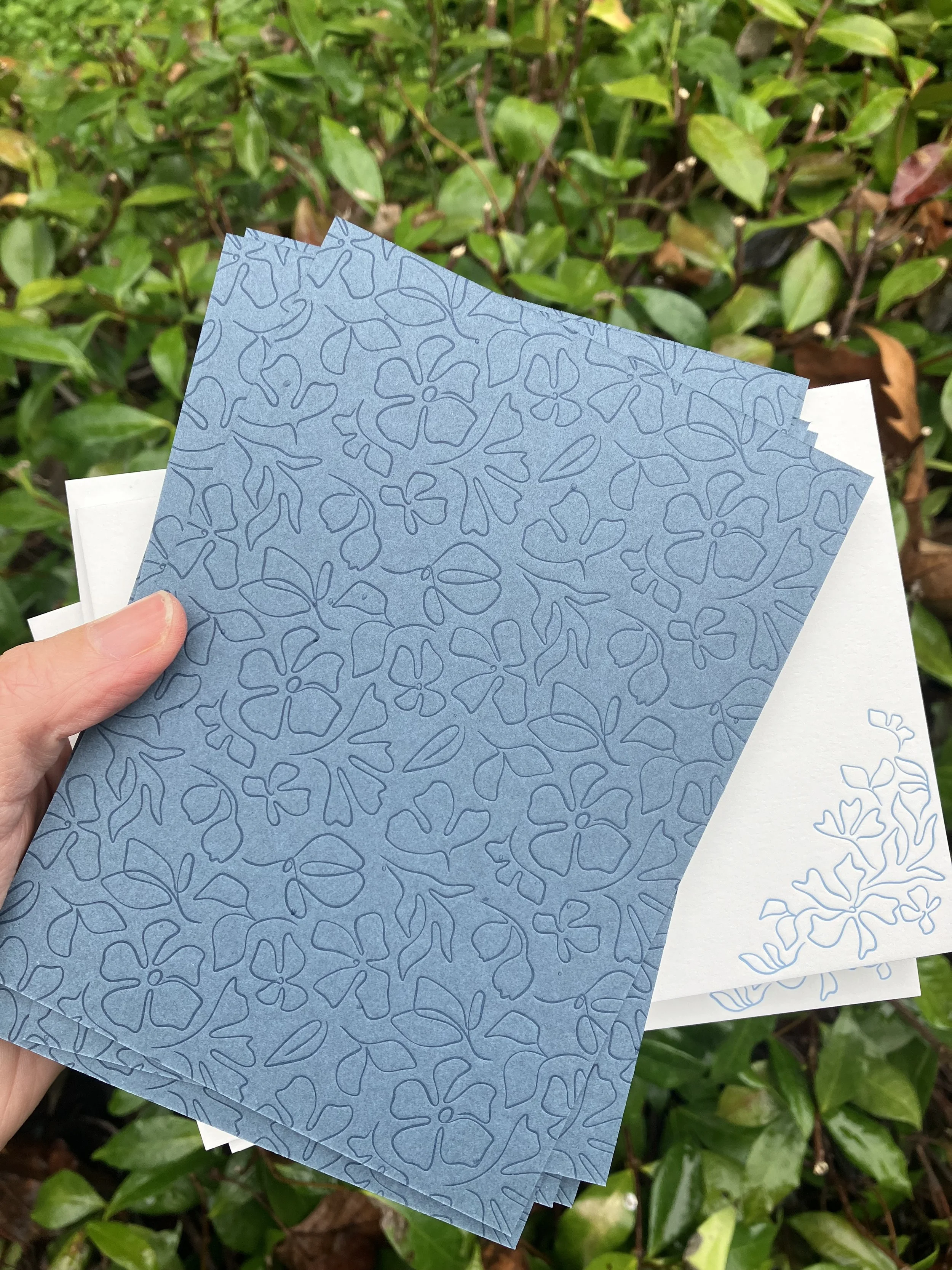
However, there is one major caveat. You might have noticed that some of the colorful letterpress printed designs you've come across are tone on tone, i.e., the ink color used is the same color as the paper, just a couple of shades darker. That's because all letterpress ink is somewhat transparent, so the color of the paper you're printing on affects how the ink will appear. If you're using a very pale colored paper, you could print using a dark colored ink and still maintain that inks' color in the final print. But if you were using, say, a really saturated, bright orange paper and wanted to hit a particular shade of yellow ink on it...it's not going to work. You might end up with something great, but it'll probably be a shade of orange and not the yellow you were after. You also can't print a lighter shade of ink on a darker stock for the same reasons (that's where foiling comes in and another post, I think).
So, there are some limitations to using colored papers but I absolutely love the look of tonal printing. Peach on peach? Deep blue on pale blue? Perfection.
Blue on blue is always a favorite

